Monday 9 September 2013

Achromatic and symmetry


This achromatic colour scheme uses only black, white and grey, they posses no other hue. This colour scheme is restrained and sophisticated.

The design element that has been used within this scheme is:

Symmetry, by placing the two round side tables with the lamps on both ends of the sofa with the two round cushions, it creates a sense of balance.
By doing this you can create a harmonious and beautifuly proportioned space.


Get this look:

Firstly, sound out your colour wheel. This will help you with your final colours.


Next, Create your colour pallet and remember to take this along with you when choosing your furniture.


This fabulous sofa will work into the design just as well as the sofa in the picture above.
Get this sofa here

A couple of these round cushions to sit upon the couch.
Get this here


Get these lamps here

These side tables are not the same as the ones in the picture, however they bring alot more interest!!
Get this here


This wallpaper i find is much more elegant then the one shown in the picture. This is from James Dunlop.
Get this here


Have fun!!

Sunday 1 September 2013

Tetradic


This tetradic scheme is the richest of colour schemes, it combines 4 colours on the colour wheel. Though it is hard to harmonize, if all colours are used in equal amounts the scheme may look unbalanced. So you should choose one colour to be more dominant, in this case it would be purple.

This image utlizes the use of:

Rhythm in pattern: with the floral pattern within the duvet cover then a floral pattern print on the canvas.

Line: the diagonal lines on the ceiling create a sense of interest within the room and the horizontal lines in the drapes and on the duvet cover.
Harmony in colour: pulling all the pieces of colour together to create a beautiful colour scheme.


Next:
Sound out your colour wheel and choose the four colours you wish to use, in this case we are using Yellow-orange, green,blue-purple and Red. 
However we wil be using a tint of red that looks more pink for this scheme. 


Now pick your colour pallet!
Remember to take this along with you when purchasing your furniture.


Get this look!

A deep purple for your wall and ceiling colour from Resene. If you think this is a little to dark for your taste then maybe think about going for a purple thats a little lighter.
Get this here.


This pink chandelier would be perfect for a child or teenagers bedroom. As you can tell it is not identical to the one in the picture however, it works in well with the colour scheme and looks absolutely  stunning.
Get this here.


These horizontal lined pink-red and orange drapes work well into the design. This fabric is from James Dunlop. Get this here.


This green patterned fabric would look fantastic on a chair so find a arm chair to your liking and upholster it!
Get this here.


And lastly a few fun cushions to finish off the look!
A plain orange cushion, grab a few.
Get this from here


A funky patterned cushion! The pattern is quite similar to the one on the roof.
Get this here!


Have fun!


Monday 26 August 2013

Complementary


This complementary colour scheme incorporates two colours that are adjacent to each other on the colour wheel. In this case its red-violet and yellow-green. 

As different as the colours are, they do work just beautifuly together.


This decor utilizes the use of rythem in colour splashing the pink throughout the room in the flower arrangment, the cushion and the pink throw on the end of the bed.

The headboard creates visuaI texture with the green pattern, it also utlizes the use of repetition within the headboard repeating the same print over and over again to create a larger pattern.


Next we need to select our colour pallet:


We now have our colours.
Remember to take this along with you while choosing your furniture.

Time to go shopping!


This fabric is alot different to the one in the picture, however the colour is nearly identical and will create the same feeling. 
Get this here


This little vintage bedside table is just adorable and is a little smaller then the one shown in the picture but i think its just the right size for this room. 
Get this here

This cushion will look stunning on the bed with the beautiful colours just poping out! Its more square than rectangle but it will definalty look just as beautiful.
Get this here


And lastly, a simple pink throw to finish off the look of your complementary colour scheme!
The little pom poms look so cute!
Get this here


And remember to have fun creating your space!

Sunday 18 August 2013

Split-Complementary


This split-complementary colour scheme is a variation of the complementary colour scheme. in addition to the base colour in this case is a beautiful calm blue, and it uses the two adjacent to its complement which is red and orange. The orange here definitely gives the room a pop of colour! and makes it an exciting room to decorate. 

This colour scheme has the same strong visual contrast as the complementary colour scheme, but has less tension. The split-complimentary colour scheme is often a good place to start for beginners in D.I.Y.


This colour scheme utilizes the use of visual texture, the use of orange damask pattern that is upon the wall and light shade screams feel me.
Visual texture is an illusion of having of having physical texture.

It also utilizes the use of harmony, the colours used in this image all compliment eachother and are all pulled together to create a harmonious scheme in a bedroom.

Get this look:


Firstly you will need to sound out your colour wheel. This colour scheme uses one base colour and then takes two that are adjacent to it.

The next thing you will need to do:


Pick your chosen split-complementary colour pallet, in this case its Red, Orange and Blue-green. 

You now have a colour pallet for your room!
Remember to take this with you to the design stores to help you pick out your furniture.


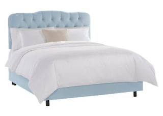
This pale blue bed frame will work in well with the interior. The blue brings calmness into the space yet still works in well with the bright pops of colour.
You can buy this here.


These red wine stools are not identical to the ones shown in the picture but they will  work just as well within the design. 
You can buy these here.


This floral wallpaper again is not identical but its the same colour and will work just as well. The hanging light shade that is featured in the picture has also been covered in this wallpaper to create a sense of rhythm in pattern. 
Get the wallpaper here.


You can purchase and cover a second hand light shade like this one here:


Time for carpet!


 Get this here.

Lastly, an orange throw for your bed to complete the look.


You can get buy this here.


And remember to have fun!

Saturday 10 August 2013

Monochromatic


This monochromatic colour scheme creates a very peacecful and subtle enviroment in which to live in. 

As you can see in the picture above they have used one colour (blue) for the decor of the room making in feel more welcoming and relaxing. They have used what looks like to be a painted timber wall and have placed them vertical to create the look of the room having a higher ceiling. Also by using the same pattern in the rug then echoing through the cushion has created a sense of rythem so that it flows. 


monochromatic color scheme uses a single color on most every room surface. In this type of scheme, various darker shades, grayer tones, and paler tints of the main color may be included in the palette. In addition, the one color is often paired with white or another neutral.

This monochromatic room in blue uses a single shade of blue paired with white. Yet it also includes dark blue cushion fabric, pale blue walls, medium blue upholstry, and a patterned area rug that includes both blue and white. 
The window and door trim as well as the ceiling might be painted in white.

Get this fabulous look:


Firstly, you wil need to sound out your colour wheel. Take the main hue and then use the shades and tints of that colour to create this look. 

The next thing you will need to do:


 Is to pick your chosen monochromatic colour scheme, in this case its blue.

We now have a colour pallet!

Make sure to take this colour pallet to the design store with you when selecting your pieces you want to put in your room.


 Any of these pillows will be perfect! There are so many patterns to choose from so go wild as long as the colour matches your pallet.

Buy these here.


Buy this here.


Make sure to mix them up with a few plain cushions aswell. 


Get this here.


Next we need to find a rug!


Yay! This will work just perfect, it is however not identical to the one in the picture. But it will still work just as well with the colout scheme. And the pattern is lovely!
Get this here.


These stylish crochet covers are just beautiful! They are hand made are the perfect finishinf touch to any room. They come in plenty of colours and even you can make them yourself! If you just dont have time then you can buy this here.


Dont stop there, add personal touches to make it your haven. Just make sure the blue matches your monochromatic colour pallet.

And remember to have fun!