
This complementary colour scheme incorporates two colours that are adjacent to each other on the colour wheel. In this case its red-violet and yellow-green.
As different as the colours are, they do work just beautifuly together.
As different as the colours are, they do work just beautifuly together.

This decor utilizes the use of rythem in colour splashing the pink throughout the room in the flower arrangment, the cushion and the pink throw on the end of the bed.
The headboard creates visuaI texture with the green pattern, it also utlizes the use of repetition within the headboard repeating the same print over and over again to create a larger pattern.
Next we need to select our colour pallet:

We now have our colours.
Remember to take this along with you while choosing your furniture.
Time to go shopping!
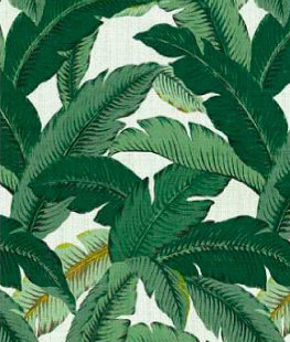
This fabric is alot different to the one in the picture, however the colour is nearly identical and will create the same feeling.
Get this here

This little vintage bedside table is just adorable and is a little smaller then the one shown in the picture but i think its just the right size for this room.
Get this here

This cushion will look stunning on the bed with the beautiful colours just poping out! Its more square than rectangle but it will definalty look just as beautiful.
Get this here

And lastly, a simple pink throw to finish off the look of your complementary colour scheme!
The little pom poms look so cute!
Get this here
And remember to have fun creating your space!
No comments:
Post a Comment